Beethoven design, EL FIN!
1.30.2007
Well I went back to having those little speaker things in the corner, just to have a little white up there. Also went in and cleaned up a few things, tightening the image here and there where lines were leaking into the wrong areas and stuff, really minor things. I've also got three colorways: red, the original turquoise, and orange. I'm pretty set on this being a bright shirt, as you can see. ;)
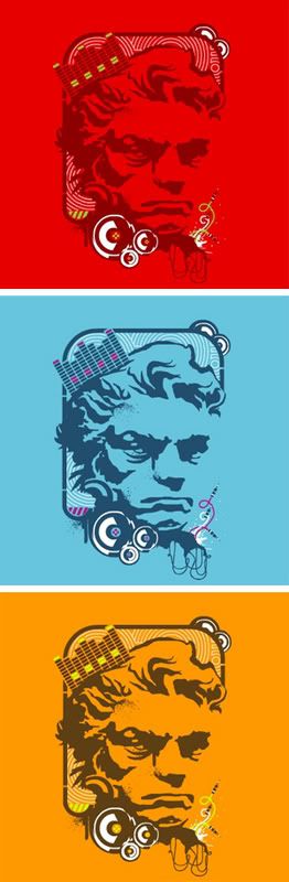
I'm personally really liking the red. Something about that red/green thing, it just really screams electronics which to me implies those giant mixer boards and other digital music equipment. But I could just be really sick of the blue...
Thoughts? Last suggestions?
Labels: designs
posted by Mr. Linty @ 11:51 PM,
![]()
![]()
2 Comments:
-
At 7:32 AM,
 Alan said...
-
I like the blue, but only because it's what we've been looking at the whole time. I wouldn't miss it though. I think LF already has a cool orange like that... I can't remember though. The red is awesome, and something new. I like it.
-
At 8:08 PM,
Mr. Linty said...
-
Cool. I'm thinking blue too. Problem with the red is that the white and green jump out way too much. Blue has a better balance there...


